Increase agent productivity
Ribbon, a venture-financed newcomer, enables first-time homebuyers to submit wholly cash-based proposals on their ideal residences, giving them an advantage in a competitive real estate market.
Client:
Ribbon Homes
Industry
Real estate technology
Role:
iOS product designer

Designing an iOS mobile app to enhance agent efficiency by simplifying the submission and handling of offers.
Currently, agents don’t have a clear call to action and are unclear about the status of their offers. The goal is to reimagine the property deal cards by making deal cards 10x simpler so that agents can manage more of their book of business through the Ribbon iOS app.
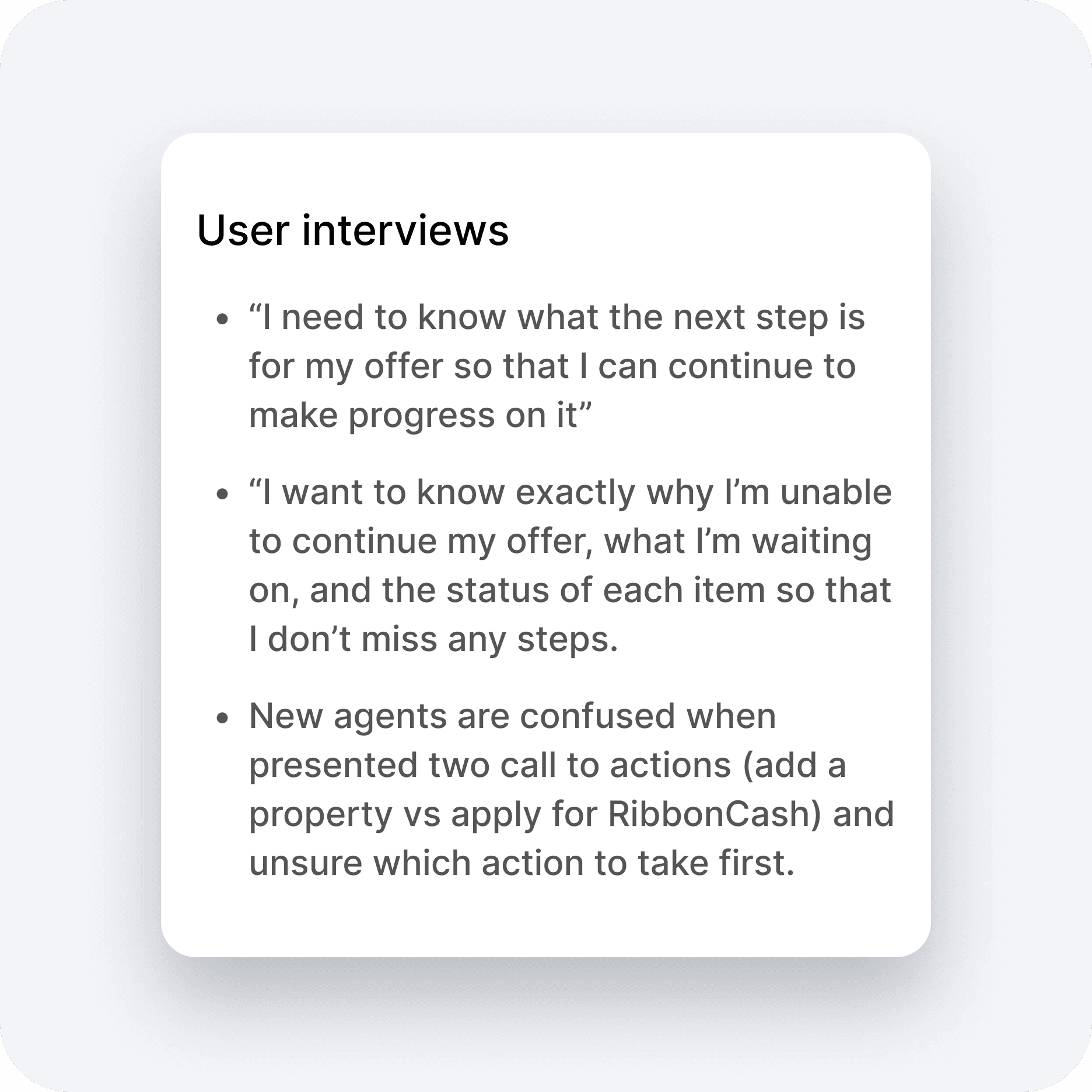
Getting to know the agents
In order to fully align with the agent's workflow, we dived into agent interviews to learn more about their journey. We interviewed 8+ agents to validate what's working and the areas we can improve on to align with the agent's mental model. Below are some key insights from the user interviews we had with both new agents and agents who have used our product:
Based on our findings, it was clear that agents want clarity as our existing experience is not easily understood by our users.
The initial steps are unclear (do they start by adding a buyer? What action do they take next?) and the rationale behind certain actions is not easily understood.
A complicated user experience only requires agents to contact an Account Manager for real-time support and guidance on the offer process which overall adds cognitive effort to the users.
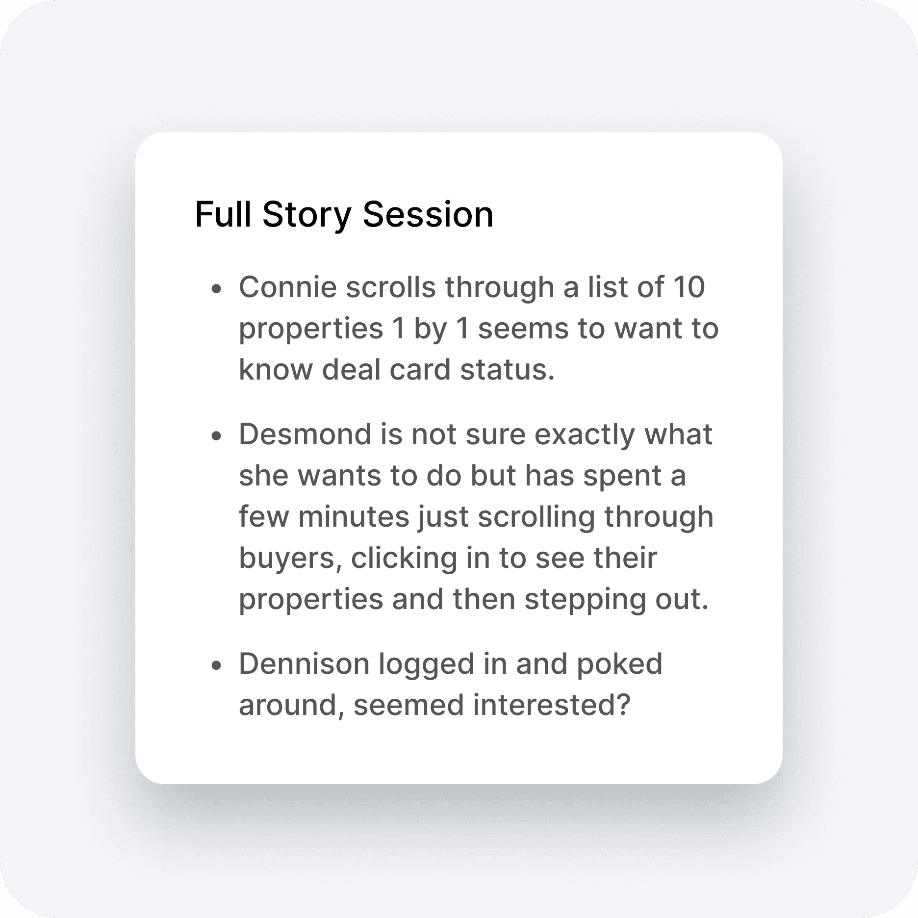
Observation
To better understand how our current agents are using our product, I watched some Full Story sessions to see exactly where people look, click, and scroll to overall understand the customer's app experience. Below are some key insights that were discovered from some of the full story sessions:
Strategize
From the data obtained during our research phase, I began to structure a course of action to counter the issue of agents missing a definitive call to action and uncertain of their offer standings. Collaborating with the Senior Product Manager, I categorized recurring themes from the agent discussions and Full Story sessions to devise a roadmap towards the solution. Below is a mind map that was created in order to help me organize a collection of information connected to a single topic and structure it in a systematic, and meaningful way.

Mid-fidelity wireframes
Based on the insights during the research phase, I was then able to start ideating and coming up with different design concepts that would solve the problem of agents being unclear about the next steps. After some designs were completed, we then tested the prototype with our Transaction Coordinators, Agents, and some Account Managers.
Defining design principles
I defined core design principles for our team to go by so that it keeps the entire team on the same path as I move through the design process
Transparency
Being candid concerning our revenue structure, cost, and charges to foster reliability and develop trust with agents.
Effects
An experience where an agent can achieve a task in a satisfied and effecive degree.
Consistent CX
Clear, consistent messaging and timely feedback so that agents know what to expect.
Buyer detail screen
After learning that agents are getting stuck on the buyer detail screen, I then applied the design principles that were set before jumping into high-fidelity designs.
Agents are now able to quickly make a decision and understand what action needs to be taken at a quick glance
Reducing the cognitive load allows for quicker decisions to be made
Providing simple language that is easy to understand the next steps
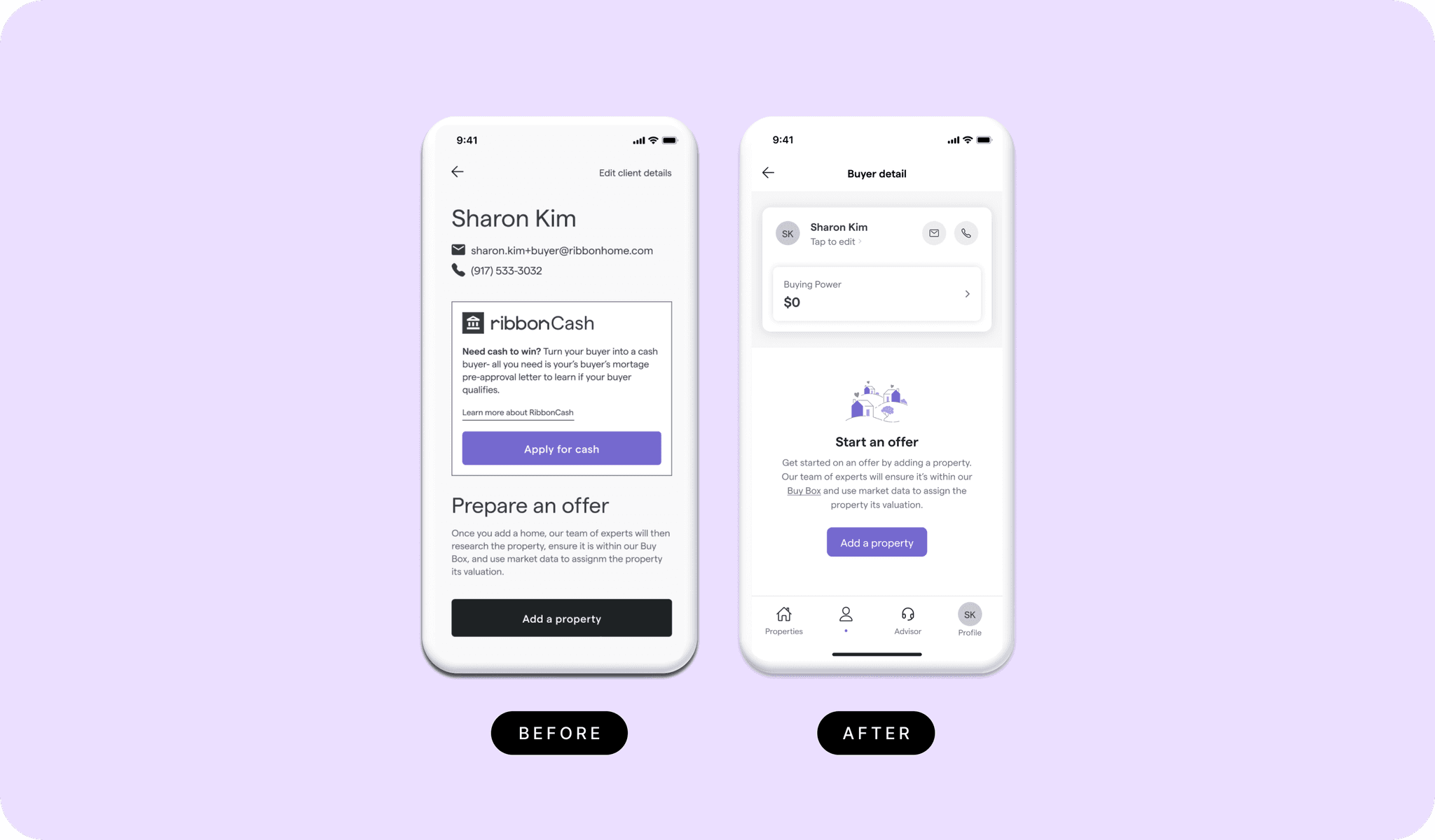
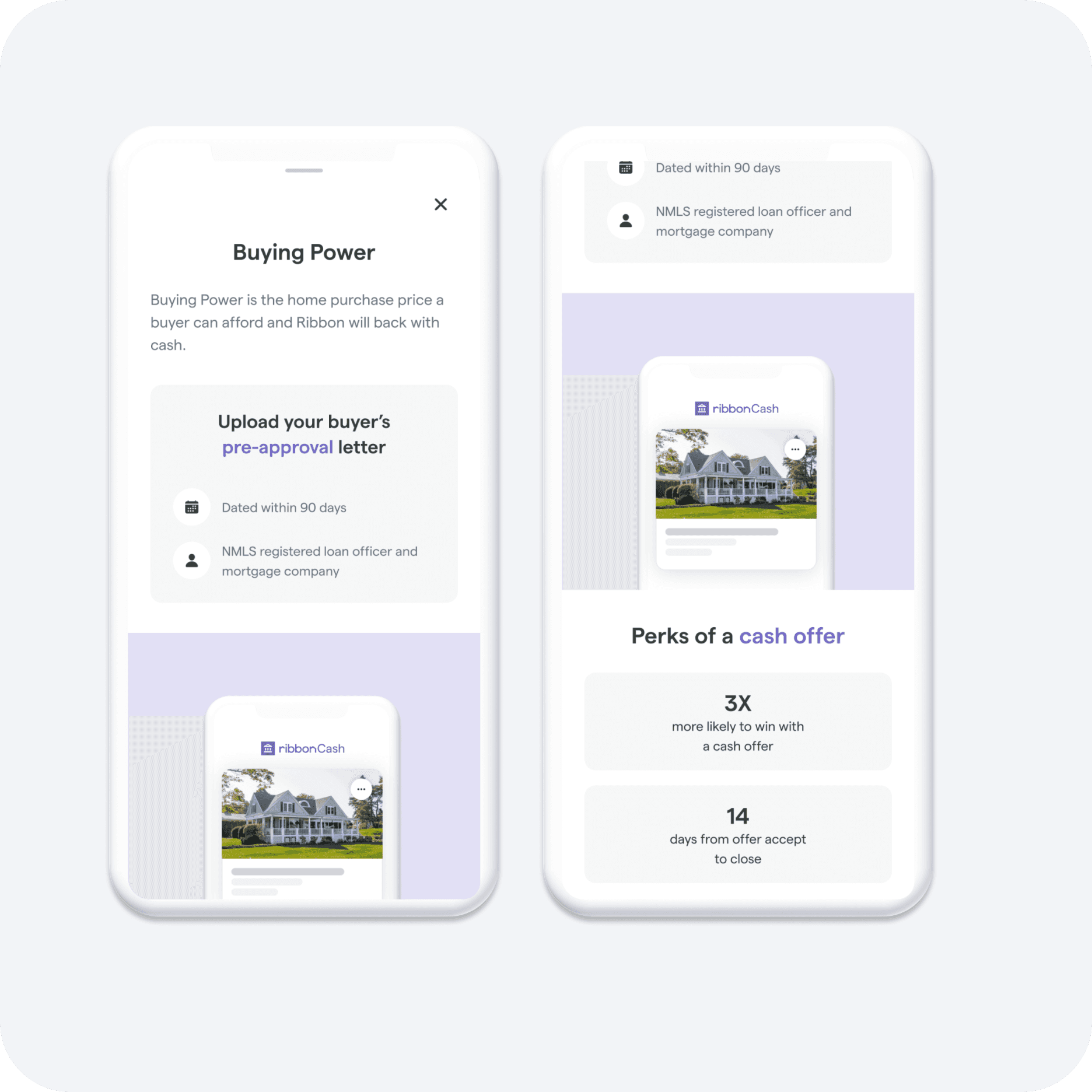
Providing clarity around our program
User research shows that people typically don’t read so I had to think of a way to reduce cognitive load while serving the goal of getting users to learn more about our cash product. The solution here was to provide clear messaging and education around buying power using simple language. Additionally, breaking up the content into clearly labeled and visually defined areas on the page created clarity.
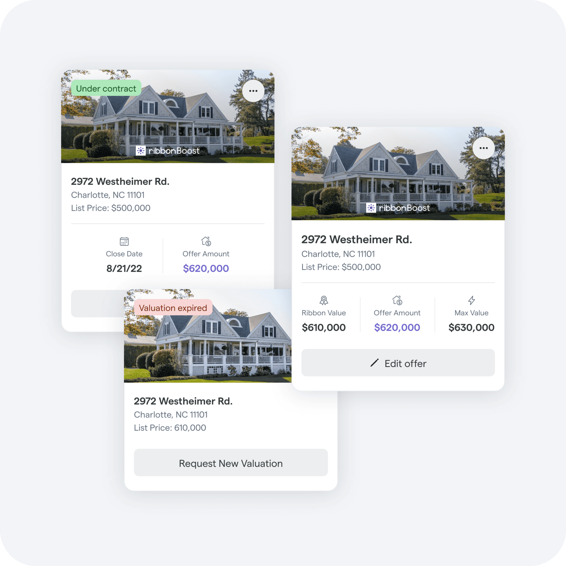
Surfacing relevant information
Our agents had a difficult time managing their properties from the iOS app since we were not matching the agent's mental model by surfacing relevant information they would need to see.
Creating a proper visual hierarchy allows the design to communicate levels of importance so agents can quickly scan for desired information.
Surfacing relevant information based for agents to complete their tasks.
Clear call-to-action buttons
Next steps
Based on user research, we learned that there is an opportunity to launch a property tab within the navigation which would streamline the agent's user journey as they are on-the-go writing offers.